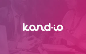
kand.io
The driven entrepreneurs behind kand.io had many recruitment experiences behind them and found there was a lot of time to be saved in the hiring process. Vork Studio was commissioned to create the company identity, online presence, and service design.
Let’s put some color on recruitment
From color choices to tone of voice, the general tone in the hiring process can be formal and uninspiring.
We wanted to break away from expectation. – But doing so without sacrificing the seriousness and delicacy of the subject. Bringing in a bright color palette suitable for a candy store, everything could quickly become a little crazy.
As a basis, 2 fonts were selected. The playful VAG Rundschrift display type for headers and highlights, and the strict sans-serif, Source Sans Pro for bread and details.
VAG Rundschrift D
Regular
ABCDEFGHIJKLMNOPQRSTUVWXYZÆØÅ
abcdefghijklmnopqrstuvwxyzæøå
0123456789 (!@#$%*&)
Regular Italic
ABCDEFGHIJKLMNOPQRSTUVWXYZÆØÅ
abcdefghijklmnopqrstuvwxyzæøå
0123456789 (!@#$%*&)
Light
ABCDEFGHIJKLMNOPQRSTUVWXYZÆØÅ
abcdefghijklmnopqrstuvwxyzæøå
0123456789 (!@#$%*&)
Light Italic
ABCDEFGHIJKLMNOPQRSTUVWXYZÆØÅ
abcdefghijklmnopqrstuvwxyzæøå
0123456789 (!@#$%*&)
Source Sans Pro
Bold
ABCDEFGHIJKLMNOPQRSTUVWXYZÆØÅ
abcdefghijklmnopqrstuvwxyzæøå
0123456789 (!@#$%*&)
Bold Italic
ABCDEFGHIJKLMNOPQRSTUVWXYZÆØÅ
abcdefghijklmnopqrstuvwxyzæøå
0123456789 (!@#$%*&)
Semibold
ABCDEFGHIJKLMNOPQRSTUVWXYZÆØÅ
abcdefghijklmnopqrstuvwxyzæøå
0123456789 (!@#$%*&)
Semibold Italic
ABCDEFGHIJKLMNOPQRSTUVWXYZÆØÅ
abcdefghijklmnopqrstuvwxyzæøå
0123456789 (!@#$%*&)
Regular
ABCDEFGHIJKLMNOPQRSTUVWXYZÆØÅ
abcdefghijklmnopqrstuvwxyzæøå
0123456789 (!@#$%*&)
Regular Italic
ABCDEFGHIJKLMNOPQRSTUVWXYZÆØÅ
abcdefghijklmnopqrstuvwxyzæøå
0123456789 (!@#$%*&)
Light
ABCDEFGHIJKLMNOPQRSTUVWXYZÆØÅ
abcdefghijklmnopqrstuvwxyzæøå
0123456789 (!@#$%*&)
Light Italic
ABCDEFGHIJKLMNOPQRSTUVWXYZÆØÅ
abcdefghijklmnopqrstuvwxyzæøå
0123456789 (!@#$%*&)

A soft logo based on strict geometry
With an inspirational offset in the selected typefaces, a completely custom logotype was created.
A set of exact dimensions were laid out, and perfect geometry was aligned within the ruleset.
Allowing each character of the logotype to freely flow to the next, builds upon the playful approach of kand.io.
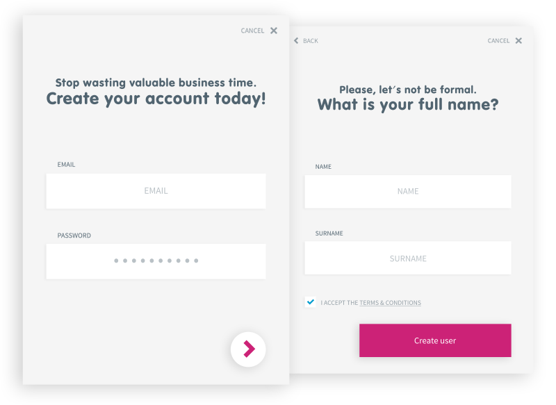
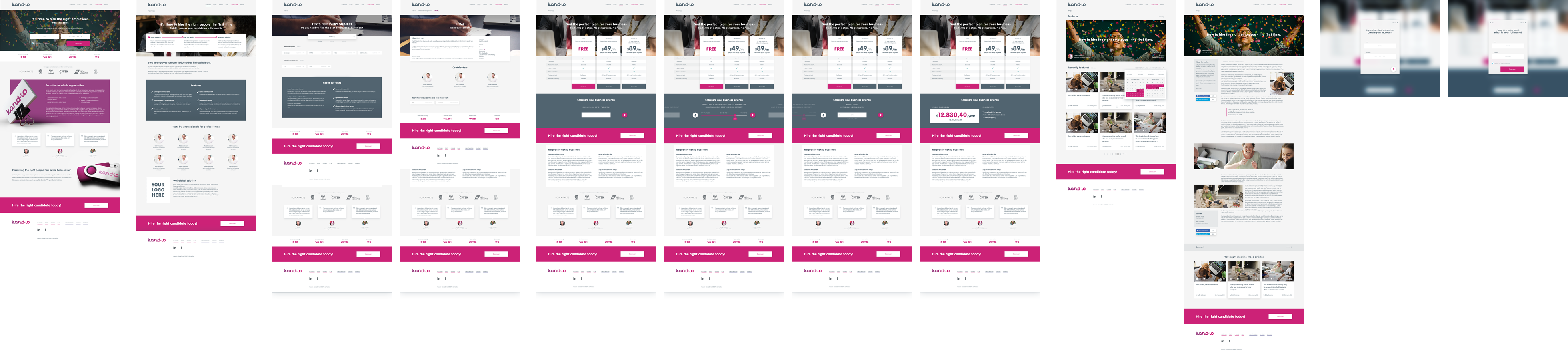
Online presence with a clear focus
– Onboarding recruiters.
Bright color usage, clear CTAs, trust establishing testimonials and references are all cornerstones to grab the visitor’s attention and curiosity.
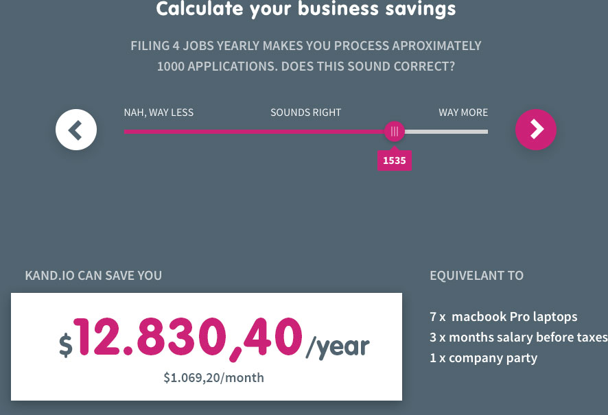
Providing the visitor with multiple ways to create their account and valuable tools to calculate and measure their actual need for the service, allowed for great product transparency.